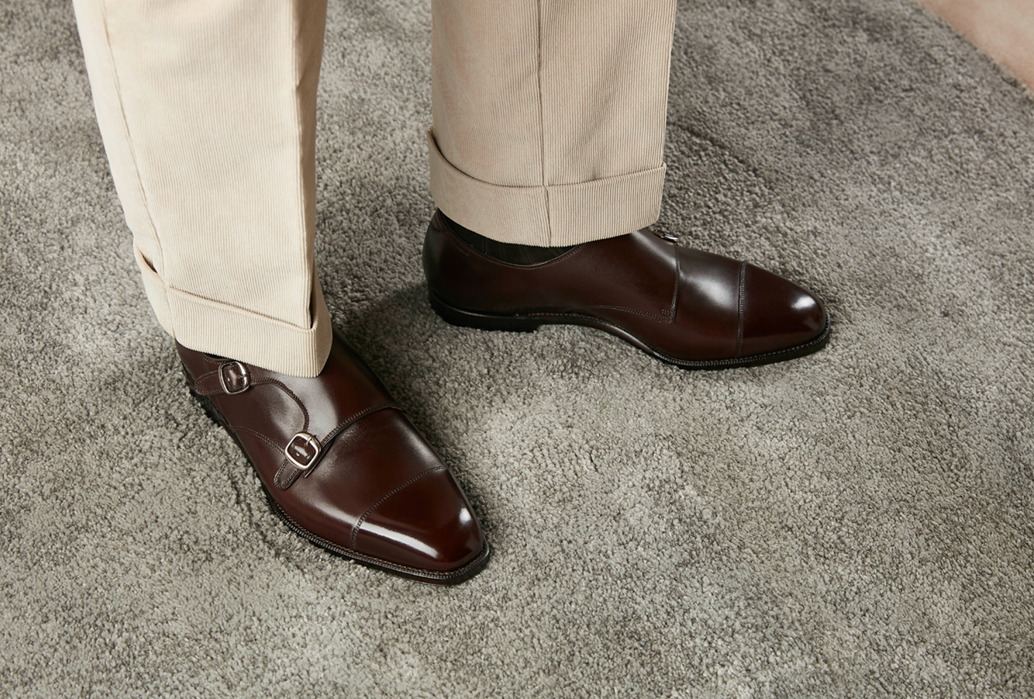
In recent two to three years, so many Chinese shoemaker emerged, and I feel it reached an platform which no significant new ones deserving attention except one or two such as dress shoe collection from Iron Boots. After following so many brands for a while, Mattina is my favorite due to its brand image building. That does not mean its products are boring, on the contrary, its products may also be the most interesting ones in the market and one leg up than most other brands. There are several Spanish shoemakers focusing on great value while the pattern designs are quite conservative to say the best, boring to be honest. It is relatively easy to have several iconic and memorable models from one brand, and the rest are forgotten, however Mattina achieves the reverse, most are great and several not so impressive. I glanced its all models for many times and divide them into three categories: Innovative, Trying and Boring.
Innovative
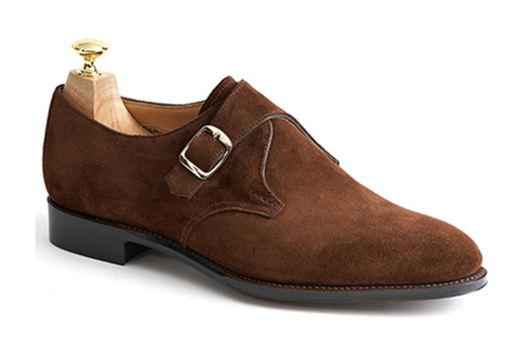
Single monk is not widely offered, the wonderful design element of Brahms is the shape of ears.
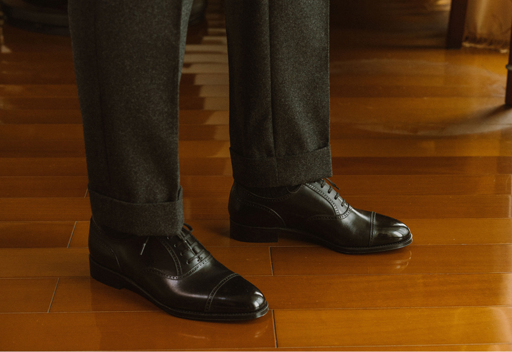
Elgar is my eternal favorite, the first one and the last one. Elgar has two versions, one without brogue the other full brogue. But the shared design element is the lacing area is a step above the quarter which is so unique and I can assure they are original.
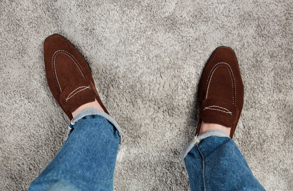
I love this one, because the “penny” is achieved by two decorative lines rather than a hole.
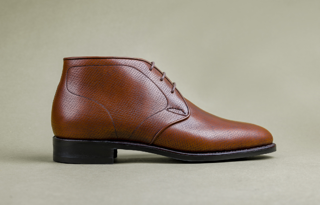
Fantastic Chukka boots, first sight catchs the shape of ears, but this is not so original as it reminds me Edward Green. But the thread forming “map” is wonderful.
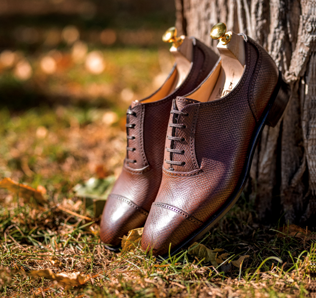
This Adelaide oxford shares the same idea with Elgar, the floating lacing area.
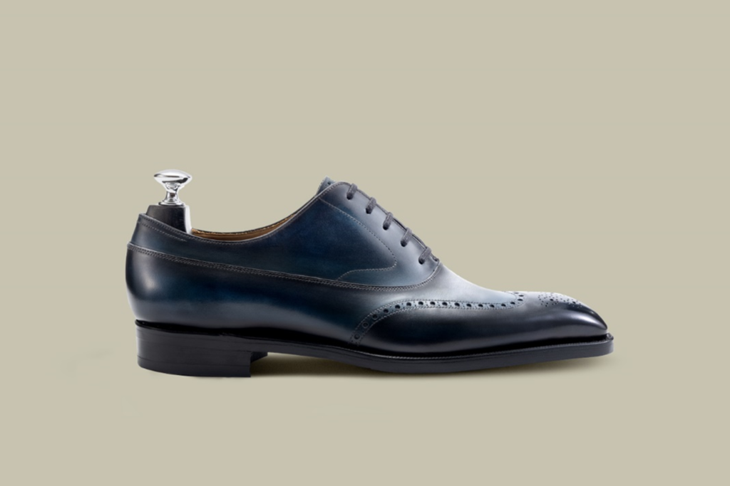
Balmoral adds Swan neck, this is already original already, plus imitation wingtip, too wonderful to be true!
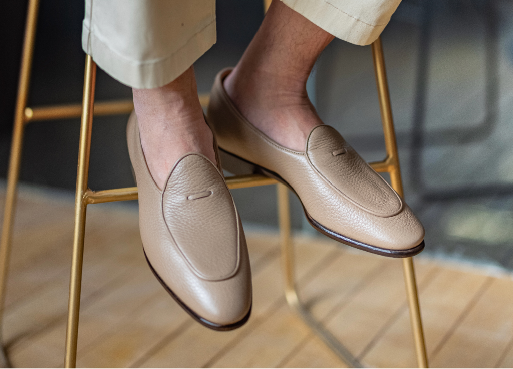
Mattina is very good using tiny elements to elevate design, this one is a good example again.
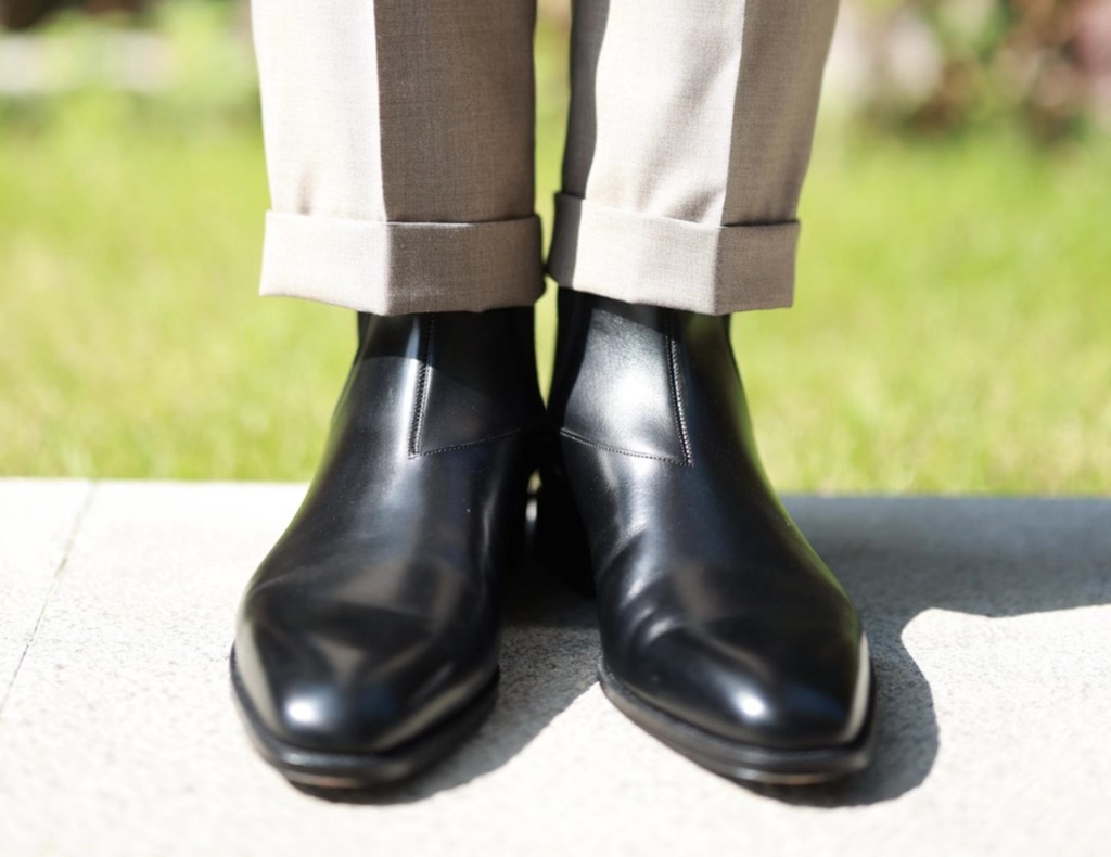
Chelsea boots are known for its simplicity while Mattina goes the other direction and have an aggressive pattern around ankle.
Trying
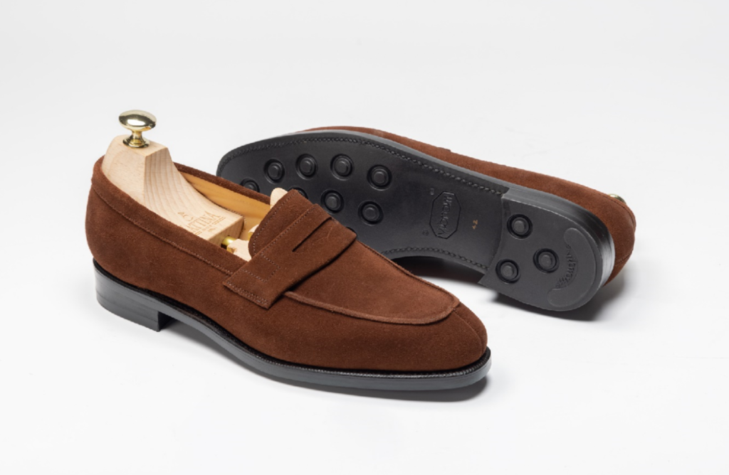
I am not sure whether it is the problem of pattern or last, but the shoes look very rough and not so compatible with the feeling of loafer should give.
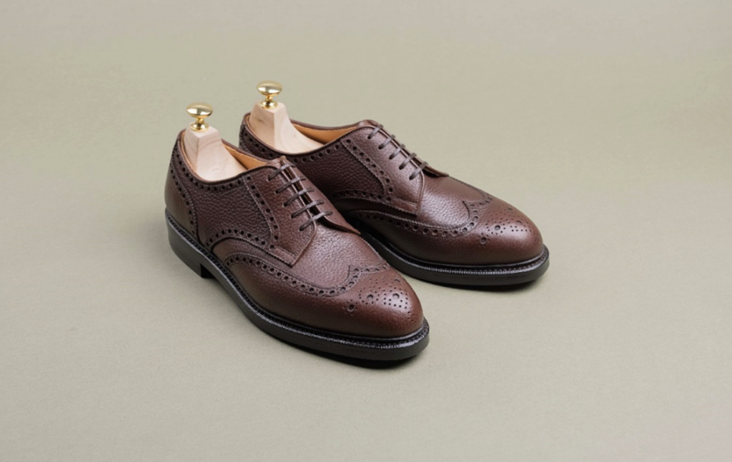
The floating lacing area does not match this very busy and complex pattern.
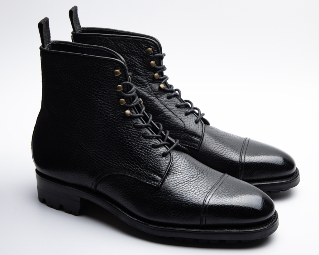
As jumper boots, the design is quite normal only with one thing, and the only thing I hate so much, the distant two threads on cap toe.
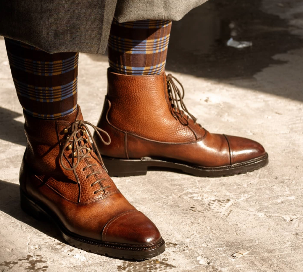
Very rough Balmoral boots exclusively for Suit Ride event, same distant lines on cap toe make me dislike.
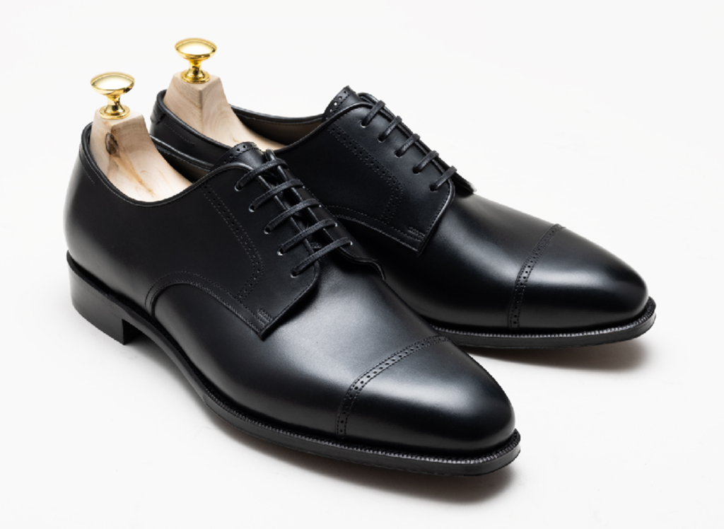
Two design elements, one is abnormally small brogue holes, the other almost vertical decorative brogue lines on quarter.
Boring
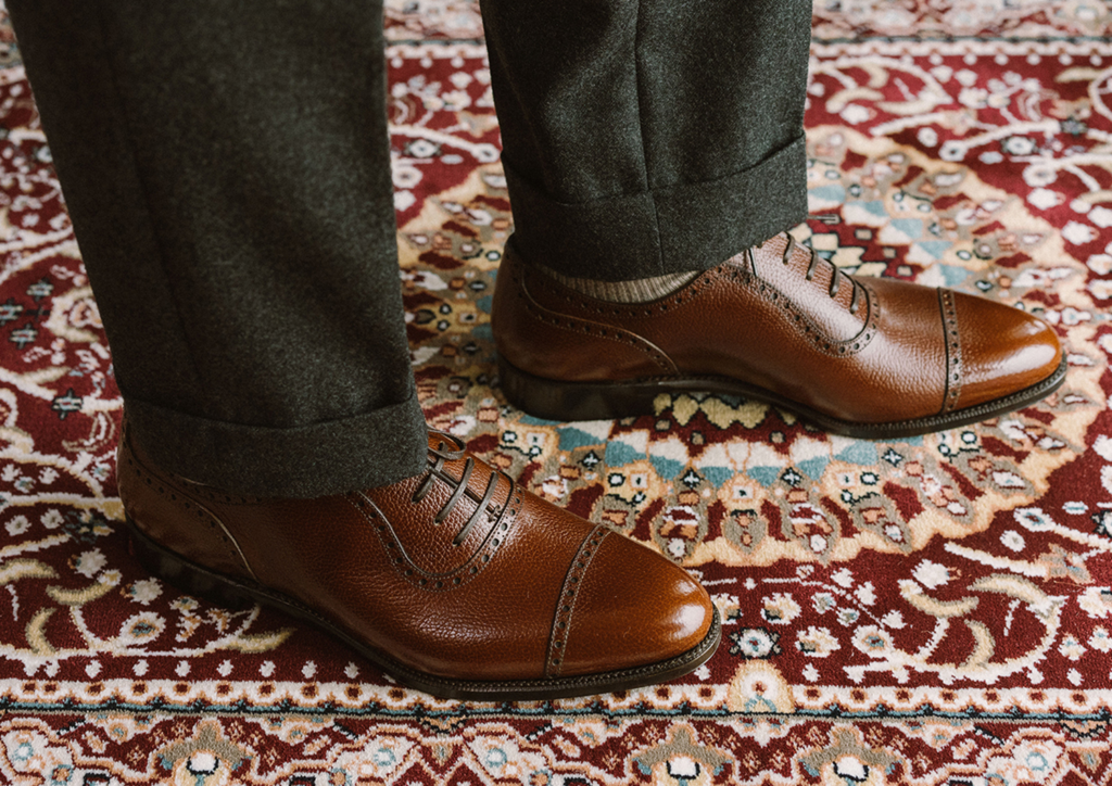
Tiny holes and more exaggerated U shape of quarter.
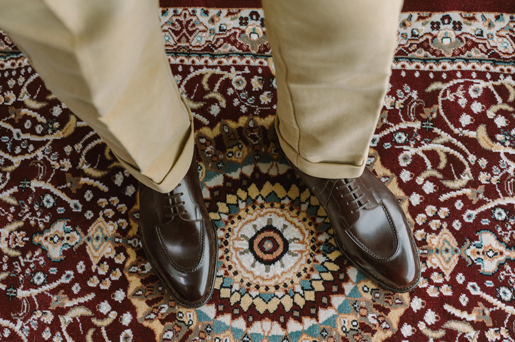
Respighi or Respighi-S put all focus on apron stitching methods rather than pattern making.
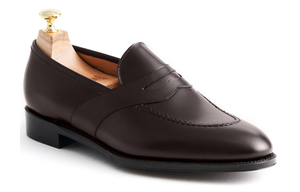
Strap loafer is less known, but this one is not so intriguing.
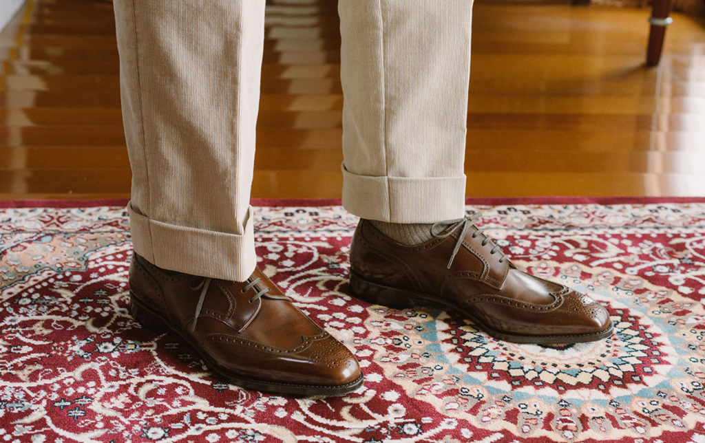
Short Wing, it is not badly made, however the feeling is stretched between formal and casual.
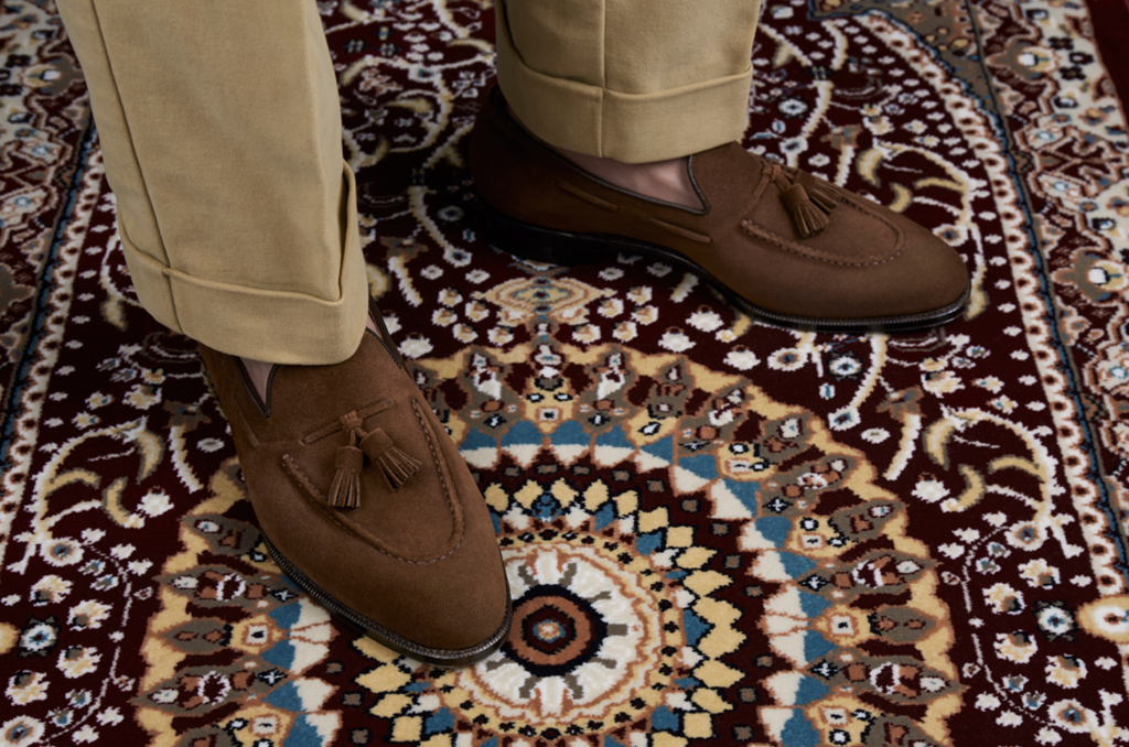
I think this tassel loafer is the same as all the others from other brands.
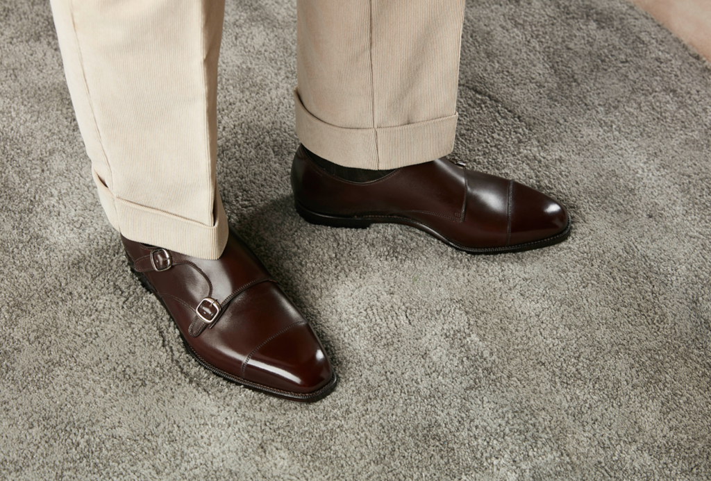
Weber sitting on N last is beautiful for sure, but for its classic design.
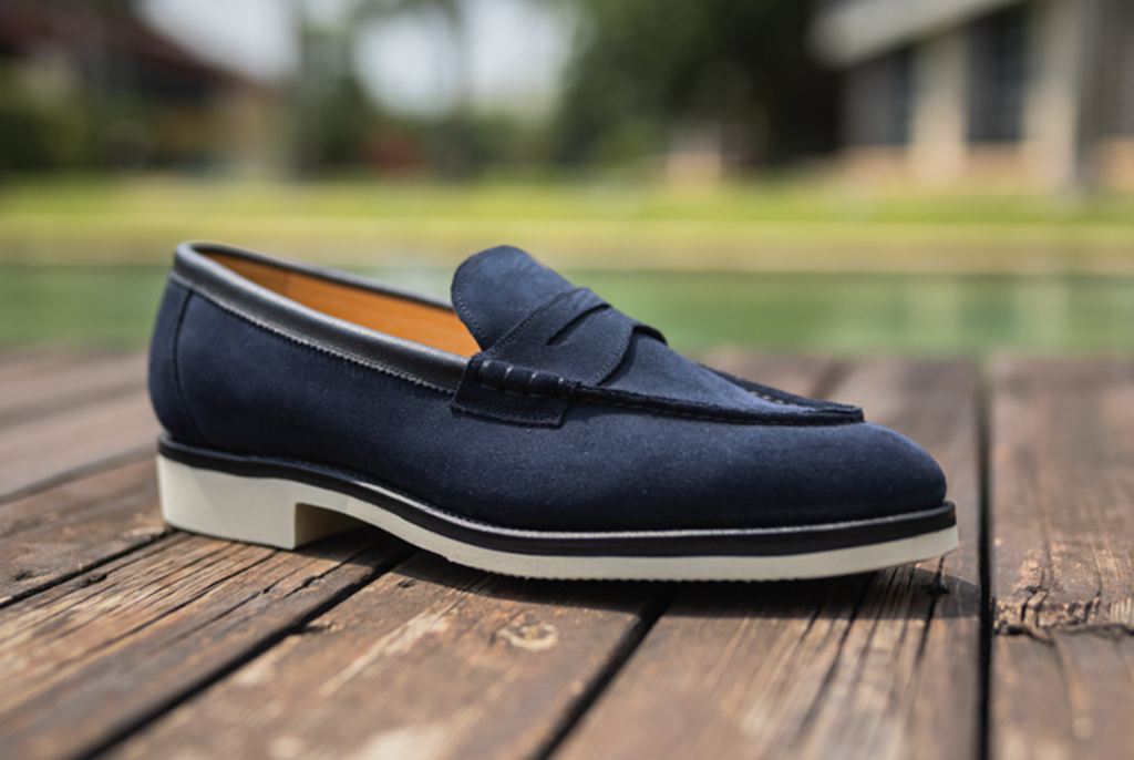
This upper pattern is classic in fact even less known, maybe the piping of opening is different from Mattina.
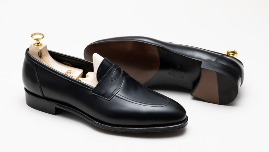
I could mistake it for Piccadilly from Edward Green.
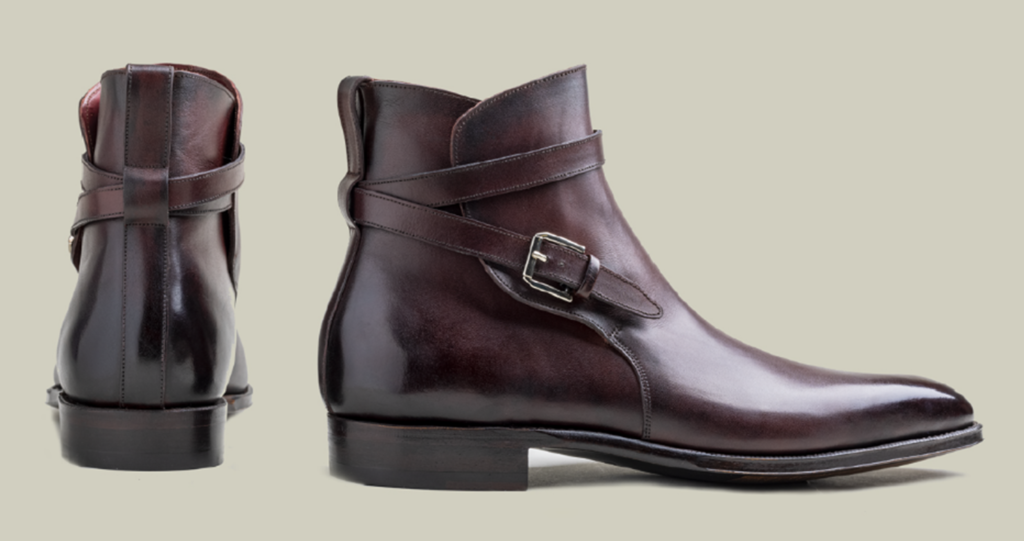
Jodhpur is not an easy model for innovation, and I don’t sense it is.
Conclusion
Nobody says innovative shoes are better looking than conservative shoes, but that is how a brand sets itself apart and memorable.

